
How we built a real estate operations dashboard with Asana charts
Short answer: Asana charts are dashboard widgets that turn data from tasks, projects, portfolios and goals into bar, stacked bar, line, donut, number and goal progress visuals. Universal reporting puts charts from all of those sources on one dashboard you share with a single link. In our real estate example, 15 charts track project health, upcoming work, work order volume, resolution time against a 48 hour SLA, time tracking and goal progress.
Most teams we work with already have the data they need in Asana. What they're missing is one place to see it. Their leaders jump between projects, portfolios and the goals tab, or someone exports everything to a spreadsheet every Friday.
For this walkthrough we built a demo workspace for a real estate operations team. It focuses on operations: the buildings being worked on, the work orders coming in, and how fast the team resolves them. Below is every chart we built, how each one is set up, and the custom fields that make them possible.
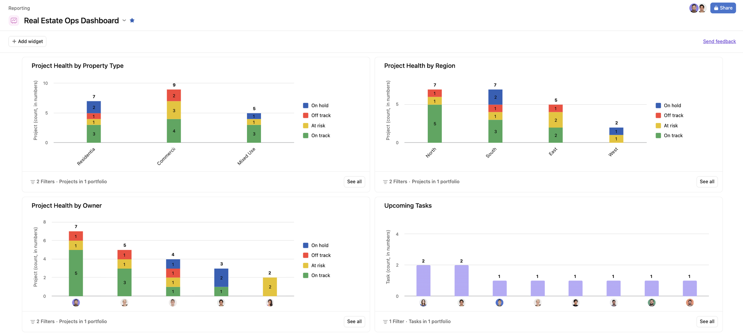
What is universal reporting in Asana?
Universal reporting is Asana's organization level dashboard, where one dashboard can hold charts built from tasks, projects, portfolios and goals.
Asana handles reporting at three levels. You can build dashboards inside a project, inside a portfolio, or in universal reporting. The first two only see the work they sit in. Universal reporting can pull from anywhere in your organization, so you set up one dashboard and share one link with the leaders who need it.
| Level | Where it lives | What it can report on |
|---|---|---|
| Project dashboard | The Dashboard tab of a project | Tasks in that project |
| Portfolio dashboard | The Dashboard tab of a portfolio | Tasks, projects and nested portfolios: all the work in that portfolio |
| Universal reporting | Strategy, then Reporting, in the sidebar | Tasks, projects, portfolios and goals across the organization |
For a long time, reporting across projects, portfolios and goals in universal reporting needed the Advanced plan. Asana now includes universal reporting on every paid plan, from Starter up. Several charts in this dashboard rely on goals reporting, time tracking and formula fields, which Asana includes from the Advanced plan.
For a full walkthrough of all three levels, see our guide to Asana dashboards and reporting.
How to create a universal reporting dashboard
From your home page, open Strategy in the sidebar, then Reporting. You'll see your starred dashboards, your recent ones, and the option to create a new one.
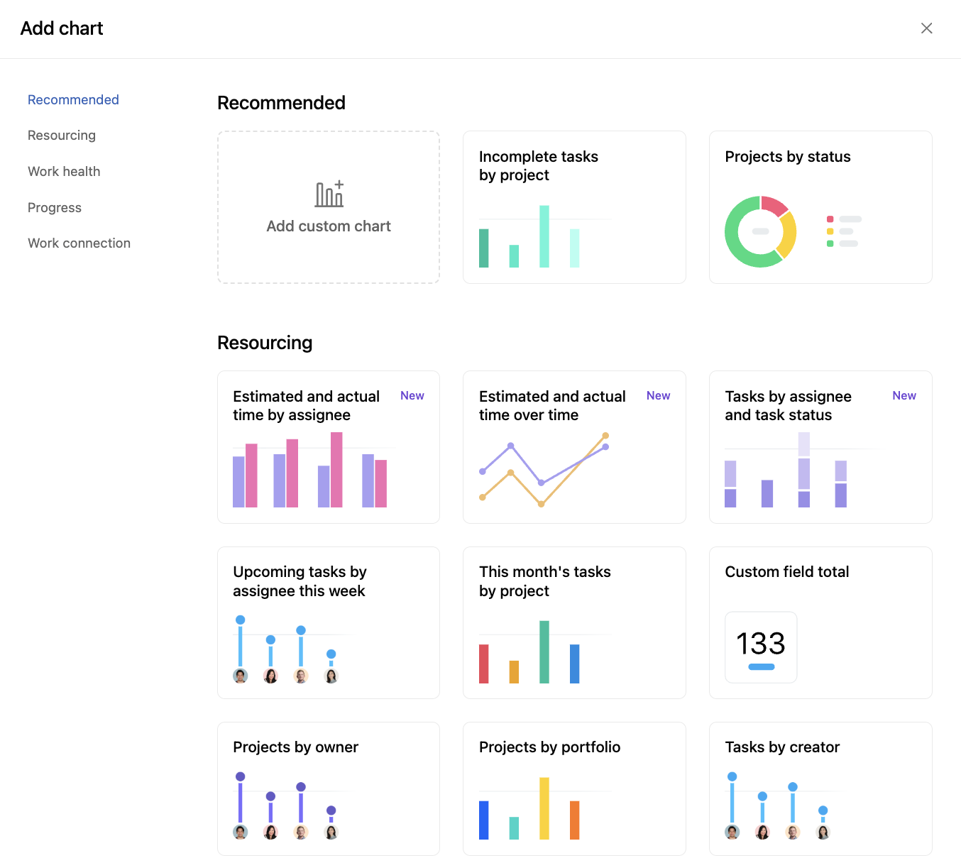
Click Create dashboard. Asana opens a set of chart templates.
Pick a template to start. Incomplete tasks by project is a good first one if you're new to the chart builder.
Open the chart details and adjust each layer: what you're reporting on, the X axis, the Y axis, filters and data annotations.
Star the dashboard so it shows in your sidebar.
Templates are the easiest way to learn how a chart is put together. Once you've seen the layers, building your own from scratch gets much faster.
Set up custom fields before you build charts
Custom fields decide how granular your charts can get. Without them, a donut chart of our 23 portfolio projects can only tell you how many are on track, at risk or off track. With a Region field and a Property type field, the same data tells you which regions and which property types are struggling.
We created both as single select custom fields in the organization's library, then added them to the Property portfolio overview portfolio and filled in a value for every project.
The most common mistake we see is adding the field at the wrong level. If Property type lives on your tasks, you can report on tasks, approvals and milestones by property type, but not on the projects themselves. To report on projects, add the field to the portfolio so it sits on each project.
| You want to report on | Add the custom field to |
|---|---|
| Projects (status, owner, health) | The portfolio, so each project carries the value |
| Tasks, milestones or approvals | The project, so each task carries the value |
Project health charts by property type, region and owner
The first three charts read the latest status update on each project in the portfolio and show the result as a stacked bar.
A regular bar chart has two layers: one value on the X axis and one on the Y axis. A stacked bar adds a third layer, grouping each bar by another field. In our first chart:
X axis: property type (residential, commercial or mixed use)
Y axis: number of projects (7 residential, 9 commercial, 5 mixed use)
Grouped by: project status
So under residential you can see three projects on track, one at risk, one off track and two on hold. The chart filters out projects marked complete, dropped or with no recent status, so it shows 21 of the 23 projects in the portfolio.
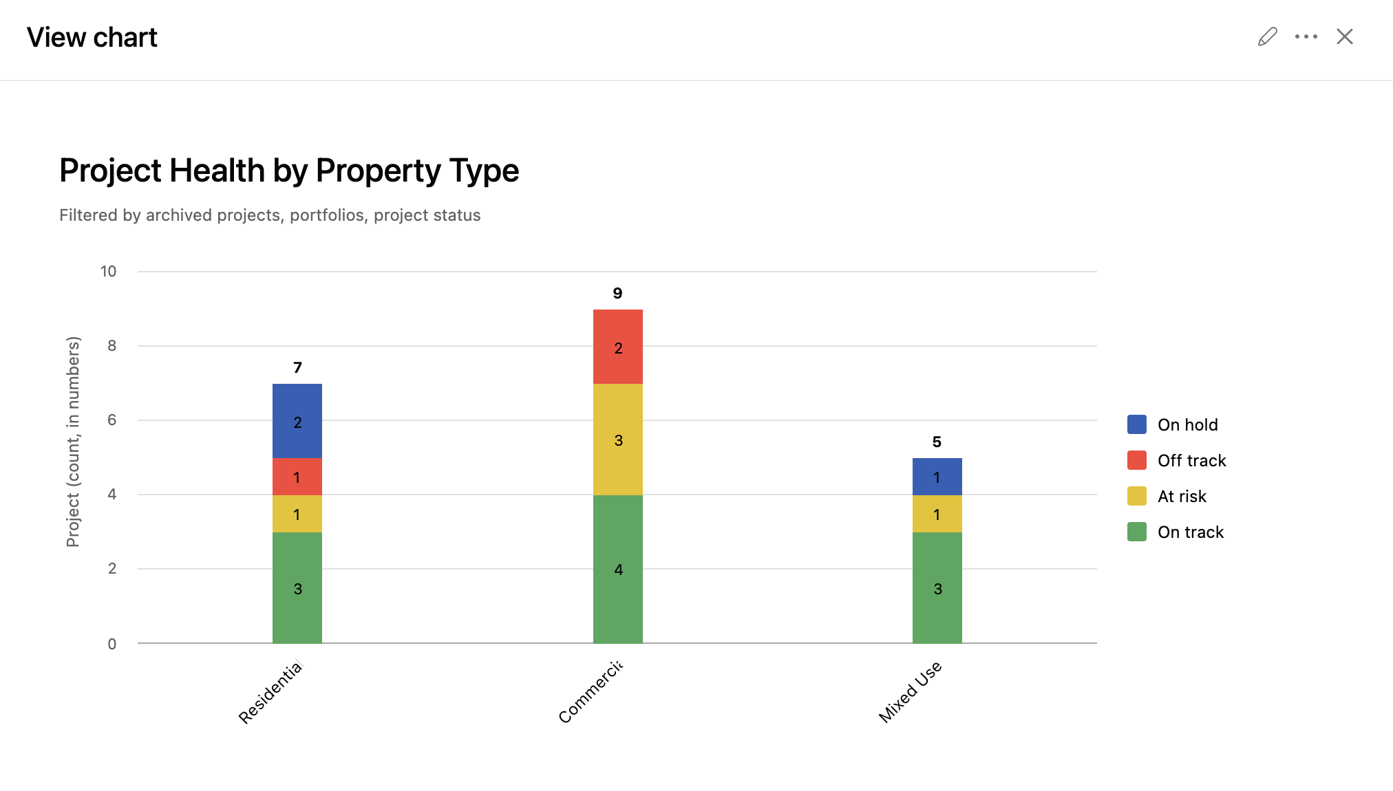
The second chart swaps property type for Region, so a regional lead can ask how the north region is doing and get the answer in one bar. The third puts the project owner on the X axis.
The owner chart needs no custom field, but it does need every project to have an owner. When you add a project to a portfolio, the owner column is right there, so fill it in as you go.
On the Advanced plan or above, you can automate this with a portfolio rule. For example, a rule can set the project owner based on the Region field, so every north region project goes to that region's lead. And if a project began as a task you converted into a project, the task's assignee becomes the project owner automatically.
Upcoming tasks, milestones and approvals by assignee
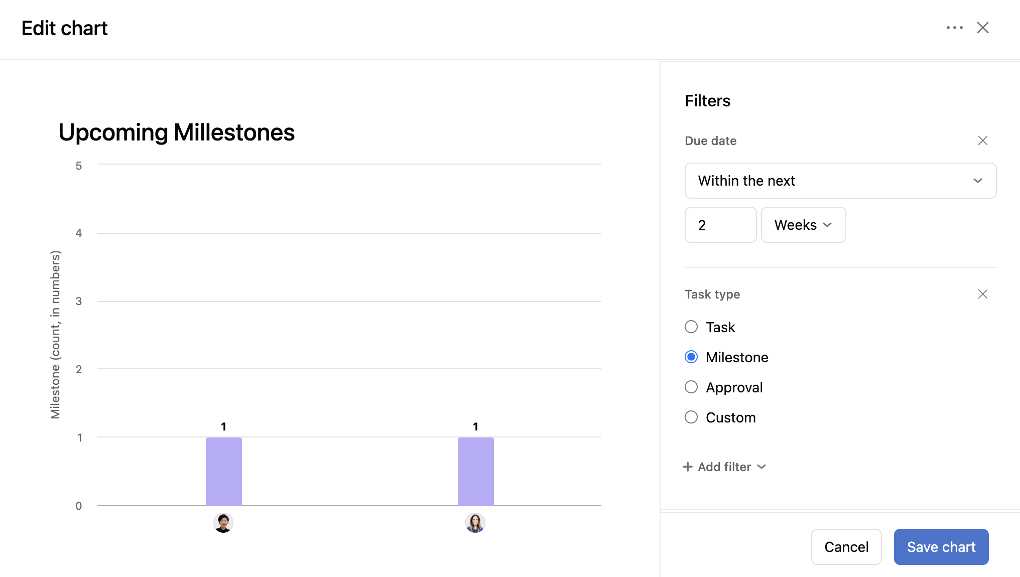
The next three charts are plain bar charts with two layers: assignee on the X axis and task count on the Y axis. What makes them different from each other is the filters.
All three report on tasks, filtered to the projects in the Property portfolio overview portfolio. Remove that filter and the chart counts every task in the organization, which isn't what an operations lead needs.
Then each chart adds its own filters:
| Chart | Filters |
|---|---|
| Upcoming tasks | Due date within the next 2 weeks |
| Upcoming milestones | Due date within the next 2 weeks, task type is milestone |
| Upcoming approvals | Due date within the next 2 weeks, task type is approval |
Two weeks is what we call upcoming. If your team plans a month ahead, change it to four weeks, or switch the unit to days or months.
Work order volume by service type and property
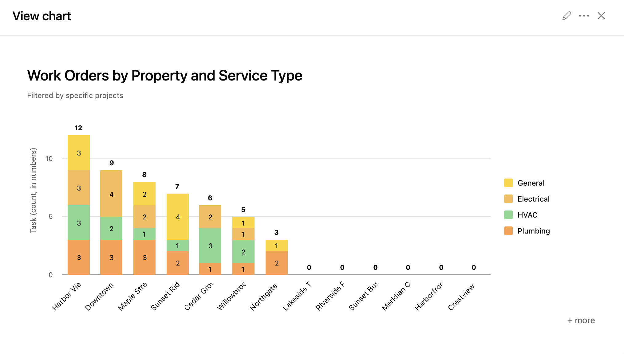
In our demo, maintenance requests come in through an intake project: plumbing, electrical and general requests for each property. That project feeds three charts, all built on the same 50 open work orders.
Work orders by service type. A single Service type custom field breaks the 50 requests down by trade.
Work orders by property. A Property custom field lists every property the company is developing in fiscal 2026.
Work orders by property and service type. A stacked bar with the property on the X axis, the work order count on the Y axis, and each bar grouped by service type. One glance shows how many requests each property has and what kind they are.
If your intake runs through an Asana form, add both fields to the form so every request arrives already tagged.
How to chart resolution time against an SLA in Asana
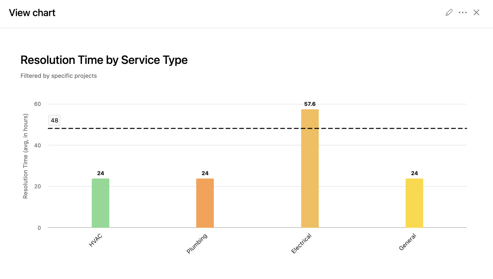
This is the chart we'd point any service team to, in real estate or anywhere else. It puts service type on the X axis and average resolution time on the Y axis, with a benchmark line at our 48 hour SLA.
In our data, three service types finish under 48 hours on average. Electrical requests average 57.66 hours, so that's where the team needs to look first.
How to build it
Create a formula custom field in the intake project and name it something like Resolution time.
Set the formula to the native Completed on date minus the native Created on date. Every task already has both, so there's nothing extra to fill in.
Add a chart to your dashboard that reports on tasks from the intake project.
Put service type on the X axis and choose your formula field on the Y axis instead of task count.
Set the calculation to average and the unit of time to hours. A sum doesn't tell you much here.
Add a benchmark line at 48 and label it with your SLA.
Benchmark lines are a recent addition to Asana charts. They draw a horizontal reference at any Y axis value, and everyone who views the chart sees them.
Estimated versus actual time and billable hours
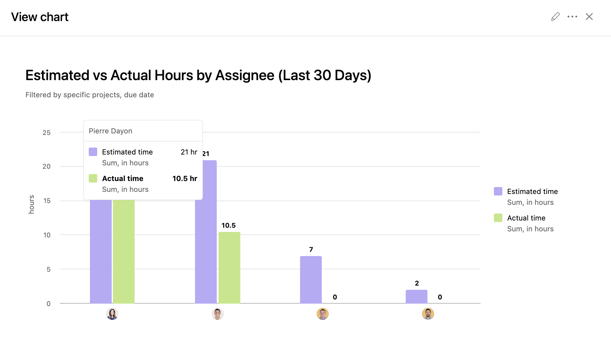
You don't need the Timesheets and budgets add on to compare estimates with reality. Asana's native time tracking fields are enough, as long as your tasks have both an estimated time and an actual time.
We built three charts on those fields:
Estimated versus actual time by assignee. Hannah, for example, has 49.5 estimated hours and 40 actual hours.
Estimated versus actual time by service type. The same comparison, broken down with the Service type field from the work order charts.
Billable versus non billable hours. A task level custom field marks each task as billable or non billable, and the chart splits the hours accordingly.
To switch a chart from task counts to hours, change the Y axis from tasks to the time tracking field.
If you'd rather have your team log time in a weekly timesheet instead of on individual tasks, and want a dedicated project budget that draws on the time tracked, the Asana Timesheets and budgets add on is built for that.
Goals charts on the same dashboard
Goals charts work like any other chart. You choose goals as the thing you're reporting on, then pick the layers. Ours puts the goal owner on the X axis and the number of goals on the Y axis, grouped by goal status.
The newer option is the goal progress chart, which shows one goal's progress without anyone opening the goals tab.
Click Add widget and choose a template chart.
Scroll to Work connection and select Goal.
Type the goal's name, or pick it from the dropdown.
Our example goal is "Reduce average maintenance turnaround by 15%". The chart shows it at 45%, last updated August 19, along with the latest status update, the time period, the accountable team and the goal owner. A View goal button opens the full goal in the sidebar.
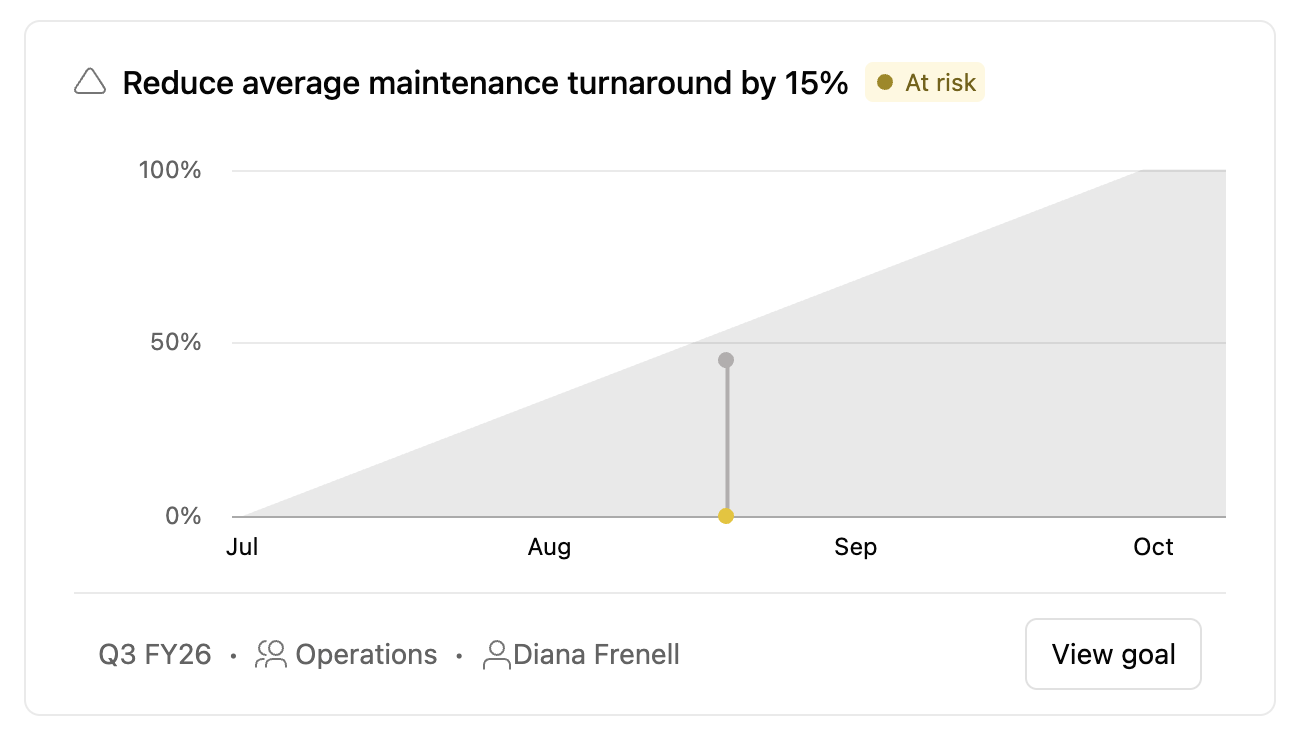
Having goals next to the operational charts is the point. Leaders see the target and the work behind it in one place, without moving around Asana.
We cover four more goal chart setups in our post on building an Asana goals dashboard.
How to share an Asana dashboard
Universal dashboards are private to their owner by default. Click Share on the dashboard and add teams or individual teammates, or make it visible to your whole organization so everyone can view it. People you share with get view only access. A dashboard can have just one admin, so if you make someone else the admin, you lose edit access yourself.
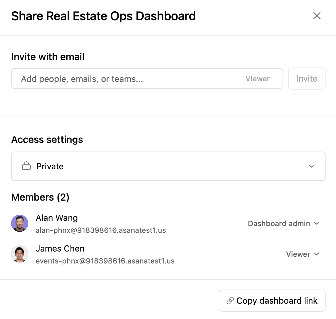
Charts look the same to everyone who views the dashboard and follow the dashboard creator's permissions, so check what you have access to before you share widely. When a viewer clicks into a chart segment, though, they only see the underlying work they have access to.
When to move from Asana charts to Power BI or Tableau
Everything in this dashboard is native Asana, with no exports and no integrations. For most operations teams that covers the weekly questions.
Asana also integrates with Power BI and Tableau, and that's the route when you need to blend Asana data with your CRM or finance system, or build visuals Asana's chart builder doesn't offer. Asana includes both integrations from the Advanced plan.
All 15 Asana charts in the real estate dashboard
Use this as a recipe list. Each row is one chart from the video, with the settings you need to rebuild it.
| Chart | Reports on | Chart type | X axis | Y axis | Group by or filter |
|---|---|---|---|---|---|
| Project health by property type | Projects in the portfolio | Stacked bar | Property type | Project count | Grouped by status |
| Project health by region | Projects in the portfolio | Stacked bar | Region | Project count | Grouped by status |
| Project health by owner | Projects in the portfolio | Stacked bar | Project owner | Project count | Grouped by status |
| Upcoming tasks | Tasks in the portfolio | Bar | Assignee | Task count | Due in next 2 weeks |
| Upcoming milestones | Tasks in the portfolio | Bar | Assignee | Task count | Due in next 2 weeks, type is milestone |
| Upcoming approvals | Tasks in the portfolio | Bar | Assignee | Task count | Due in next 2 weeks, type is approval |
| Work orders by service type | Tasks in the intake project | Bar | Service type | Task count | None |
| Work orders by property | Tasks in the intake project | Bar | Property | Task count | None |
| Work orders by property and service type | Tasks in the intake project | Stacked bar | Property | Task count | Grouped by service type |
| Resolution time by service type | Tasks in the intake project | Bar | Service type | Resolution time formula, average, hours | Benchmark line at 48 hours |
| Estimated versus actual time by assignee | Tasks in the portfolio | Bar | Assignee | Estimated and actual time | None |
| Estimated versus actual time by service type | Tasks in the portfolio | Bar | Service type | Estimated and actual time | None |
| Billable versus non billable hours | Tasks in the portfolio | Bar | Billable field | Actual time | None |
| Goals by owner | Goals | Stacked bar | Goal owner | Goal count | Grouped by goal status |
| Goal progress | One goal | Goal progress | Not applicable | Not applicable | Work connection, then Goal |
Get a second set of eyes on your Asana reporting
If your dashboards aren't answering the questions your leaders ask, the fix is usually in the setup underneath: custom fields at the wrong level, projects without owners, or status updates nobody posts.
Our Asana Health Check is built for that. We meet with you, review your instance, and hand you a full report with the quick wins and next steps, which you can tackle yourself or with one of our solutions engineers. Book a call to get started.
Frequently asked questions
What types of charts can you create in Asana?
Asana dashboards support bar, stacked bar, grouped bar, line, burnup, burndown, donut, number and lollipop charts, plus a goal progress chart for a single goal. You choose what the chart reports on, then set the X axis, the Y axis, the grouping and any filters. Chart templates give you a working starting point you can edit.
Where is universal reporting in Asana?
Universal reporting lives under Strategy in the Asana sidebar, then Reporting. From there you can open starred and recent dashboards or create a new one. If you don't see Reporting, your admin may have turned universal reporting off in the admin console.
Which Asana plan includes universal reporting?
Universal reporting is included on every paid Asana plan, from Starter up. For a long time, reporting across projects, portfolios and goals needed the Advanced plan. Goals reporting still does, along with native time tracking, formula custom fields and the Power BI and Tableau integrations.
How do you calculate resolution time in Asana?
Create a formula custom field that subtracts the native Created on date from the native Completed on date. Add it to the project, then chart it on the Y axis with the calculation set to average and the unit set to hours. Because both dates are automatic, nobody has to enter anything extra.
Can you add a target or SLA line to an Asana chart?
Yes. Asana charts support benchmark lines, which draw a horizontal reference at any Y axis value with a custom label. Everyone who views the chart sees the line.
Why can't I report on projects by a custom field?
The custom field is probably on your tasks instead of your projects. Task level fields let you report on tasks, milestones and approvals, but not on the projects themselves. Add the field to the portfolio and fill it in for each project, and it becomes available for project charts.
Can you show goal progress on an Asana dashboard?
Yes. Add a template chart, choose Work connection, then Goal, and type the goal's name. The chart shows the goal's progress, latest status update, time period, accountable team and owner, with a button that opens the full goal.