
Asana dashboards and reporting: the complete guide, with 10 examples you can copy
Short answer: Asana has three levels of reporting. Project dashboards cover one project. Portfolio dashboards roll up a group of projects. Universal reporting builds charts across your whole organization, pulling from tasks, projects, portfolios, and goals. Project dashboards are available from the Starter plan, portfolio dashboards and universal reporting from Advanced. You build a dashboard by adding charts, choosing what each one reports on, and filtering it down. Your custom fields decide what is possible, so weak field hygiene is usually the real reason a dashboard looks thin. Asana can also chart duration, not just counts, including average time in a section or in a custom field value.
The dashboard tab is not the problem
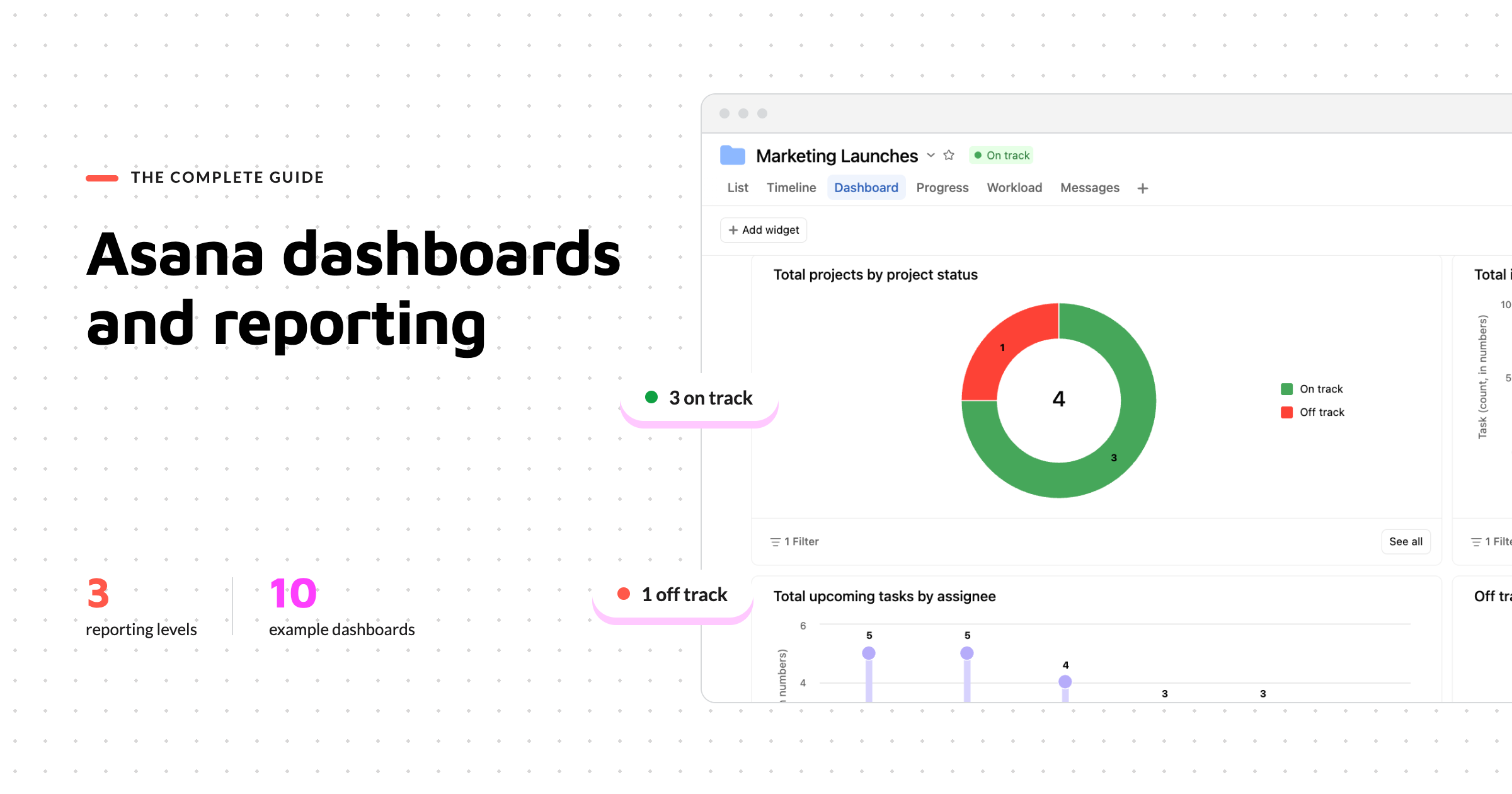
Someone asks you for an update on where things stand. You open the Dashboard tab of your project, and Asana has helpfully pre populated a few charts. Tasks by assignee. Tasks by completion status. A count of overdue work.
None of it answers the question you were asked.
This is the moment most people decide Asana's reporting is limited. It usually is not. The default charts are generic because Asana has no idea what you care about yet, and the charts that would answer your question need custom fields that either do not exist or are not being filled in consistently.
The good news is that the gap between a generic dashboard and a useful one is smaller than it looks. It is mostly a matter of knowing which level to report at, what the chart builder can actually do, and which fields to put in place first.
Here is all of it.
Where reporting lives in Asana: the three levels
Reporting in Asana happens in three places, and picking the wrong one is the most common reason people conclude a chart is impossible.
Project dashboards live in the Dashboard tab of any project. They report on the tasks in that one project. This is where you go for sprint progress, campaign status, or anything scoped to a single piece of work.
Portfolio dashboards live in the Dashboard tab of a portfolio. They report across every project in that portfolio, which makes them the right home for program level views: how many projects are off track, which teams are carrying the most, how status has moved over the quarter.
They are not limited to project level data either. You can report on the tasks inside those projects too, which is how you chart tasks by status, owner, or due date across an entire program at once rather than rebuilding the same chart inside each project.
Portfolios carry other reporting surfaces that are easy to confuse with the dashboard, and they are worth naming so you know where to look. Workload shows how effort is spread across people over time. Capacity planning looks at whether you have the people to take on what is coming next.
Both answer resourcing questions rather than progress questions, and neither works like the chart builder does. They deserve their own guide rather than a paragraph here, so this one stays on dashboards.
Universal dashboards live under Strategy in the sidebar, then Reporting, which is where you create a new dashboard. This is the flexible level. You can build charts that pull from tasks, projects, portfolios, and goals across the whole organization.
| Project dashboard | Portfolio dashboard | Universal dashboard | |
|---|---|---|---|
| Where it lives | Dashboard tab of a project | Dashboard tab of a portfolio | Strategy > Reporting in the sidebar |
| What it reports on | Tasks in that project | Projects and tasks in that portfolio | Tasks, projects, portfolios, and goals |
| Scope | One project | One portfolio | Whole organization, or filtered |
| Best for | Sprint and campaign tracking | Program and delivery oversight | Cross functional and executive views |
| Plan | Starter and above | Advanced and above | Advanced and above |
The rule of thumb: report at the level your question lives at. "How is this launch going" is a project question. "How are all our launches going" is a portfolio question. "How is every team tracking against goals this quarter" is a universal reporting question.
Audience is the second consideration, and it sometimes overrides the first. A project dashboard means the reader has to open that project to see it. If your audience is senior and will look once a month, universal reporting is usually the better home, because one dashboard can hold charts from different sources in a single view you can share with them directly. What they see still depends on their own access, which is covered further down.
Which plan gets what
Reporting is where a lot of teams first run into a plan limit. Going from one project to many means Advanced.
| Feature | Starter | Advanced | Enterprise and Enterprise+ |
|---|---|---|---|
| Project dashboards | Yes | Yes | Yes |
| Custom charts on a project | Yes | Yes | Yes |
| Portfolio dashboards | No | Yes | Yes |
| Universal dashboards | No | Yes | Yes |
| Goals reporting | No | Yes | Yes |
If you are on Starter and constantly rebuilding the same chart in six different projects, that is the signal. You are not missing a feature, you are reporting at the wrong level, and the level you need starts at Advanced.
If you are weighing that up, our Asana pricing guide covers what else changes between the tiers.

How to build a dashboard
Wherever you are, a project's Dashboard tab, a portfolio's, or a universal dashboard under Reporting, the first click is + Add widget.
There are two kinds. Charts, and text, a blank box for context or a caveat next to a chart.
Every chart is then built from the same four decisions. Once you can see that, the chart builder stops feeling fiddly.
What am I reporting on. This is the first choice, and it differs by level, which is the part that catches people out.
On a project dashboard you pick Work, which here means the tasks in that project. If your organization has the Timesheets and Budgets add on enabled, Time entries appears as a second source.
On a portfolio dashboard you get the same two, and inside Work you then choose whether the chart reports on tasks, projects, or portfolios.
In universal reporting, Goals appears as a source as well. What is not available there is time entry data from project budgets, so anything built on that has to stay at project or portfolio level.
The choice matters downstream, because what you can group by changes with it.
What is on each axis. The horizontal axis is usually how you want the data grouped, such as by section, by assignee, or by a custom field. The vertical axis is what you are measuring, most often a count, but it can also be a sum or an average of a numeric or time based value.
What am I filtering out. Filters are where a generic chart becomes a useful one. Completion status, specific teams, specific field values, and dates.
Dates deserve a closer look, because the options change with your source. A chart reporting on projects can filter by start date, due date, completion date, or creation date. A chart reporting on tasks gets due date, completion date, and creation date, with no start date.
Choose deliberately, because campaigns that started this quarter and campaigns due this quarter are two different sets of projects.
How should it look. Bar, stacked bar, grouped bar, line, burnup, burndown, donut, number, and lollipop. Pick by what the chart is for rather than what looks best. Number charts for a single figure someone needs to see at a glance. Donut for composition. Line, burnup, and burndown for change over time. Bar for comparison across categories, with stacked and grouped when you need a second dimension in the same chart.
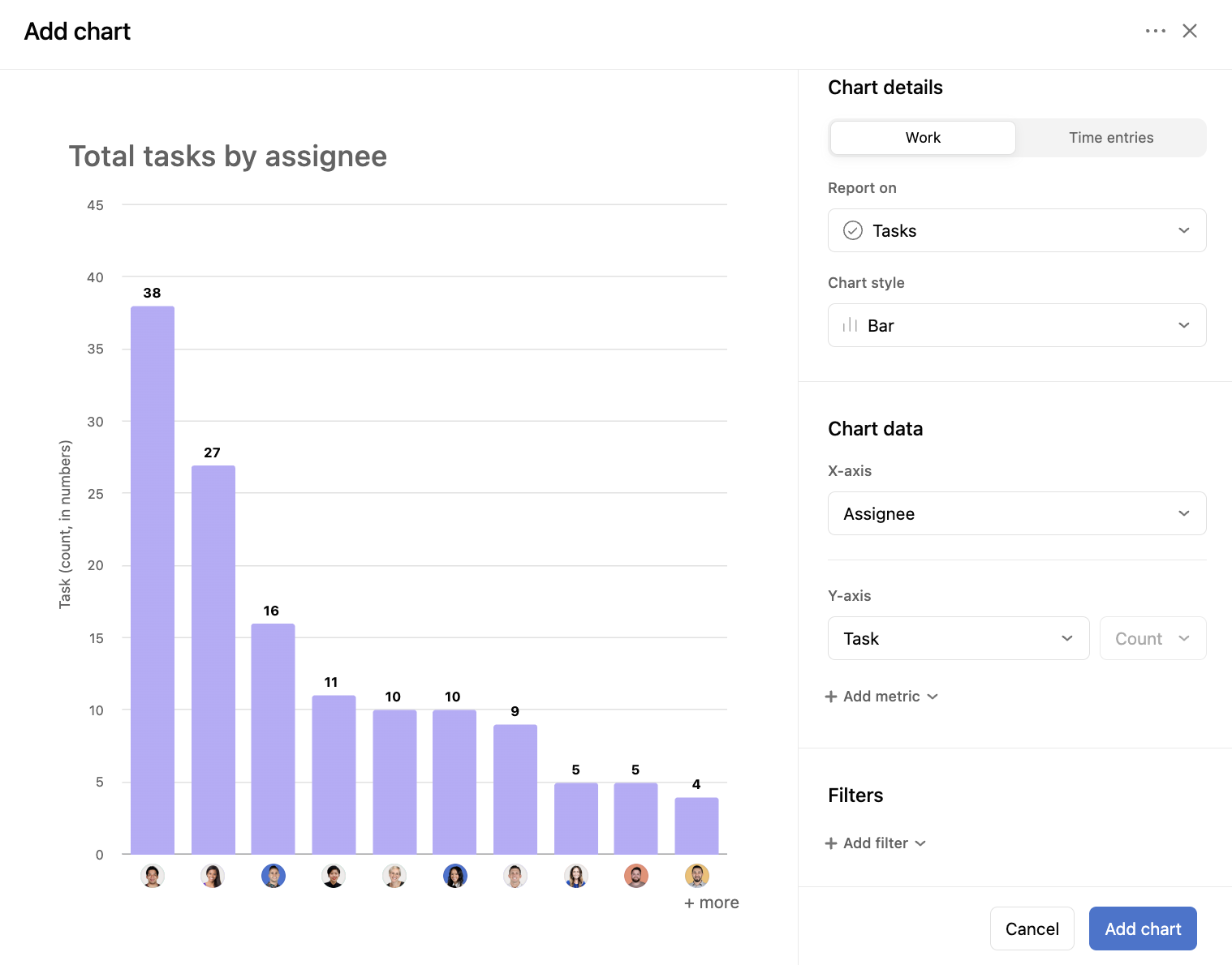
One practical thing worth knowing: charts are interactive. Clicking a data point takes you to the tasks, projects, or goals behind it. Click an overdue count and you land on the overdue tasks, ready to reassign or push the date.
Ten Asana dashboard examples you can copy
A word on templates first, because this is where people get stuck. Universal reporting gives you chart templates to start from. Project and portfolio dashboards do not, and there is no way to save a custom chart as a template to reuse elsewhere.
There is a way around it for projects. Build the dashboard you want in a live project, then convert that project to a template. Asana saves the dashboard tab with it, so every project created from that template arrives with the charts already built. What you cannot do is build the dashboard from inside the template editor. It only works by saving from a project.
So treat each of the ten below as a configuration. Build it once in a project you plan to template, and every project made from that template has it.
1. Executive portfolio health
Level: portfolio dashboard
Answers: which of our initiatives are off track, and who owns them.
Charts:
Number chart for projects off track
Donut of projects by status
Bar of projects by owner
Needs: status updates kept current at project level, and an owner on every project.
2. Marketing campaign performance
Level: portfolio dashboard, with every campaign as a project inside it
Answers: what is in flight, by channel, and what is slipping.
Charts:
Bar of projects by campaign type, filtered to start date this quarter
Donut of projects by status, filtered to start date this quarter
Number chart for overdue tasks across the portfolio, no date filter needed
Needs: a Campaign Type field at project level, applied to every campaign project, and status updates that people actually keep current.
If your campaigns are tasks inside one project rather than projects of their own, build the same thing on that project's dashboard using task level fields. (Fair warning that this has a ceiling. One campaign as a task with thirty subtasks is fine. The fifth one is a scrolling exercise.)
3. Project delivery overview
Level: project dashboard
Answers: how much work is left, and are we clearing it fast enough to finish on time.
Charts:
Burnup of completed tasks over time
Bar of tasks by section, filtered to incomplete
Number chart for tasks with a due date in the next seven days
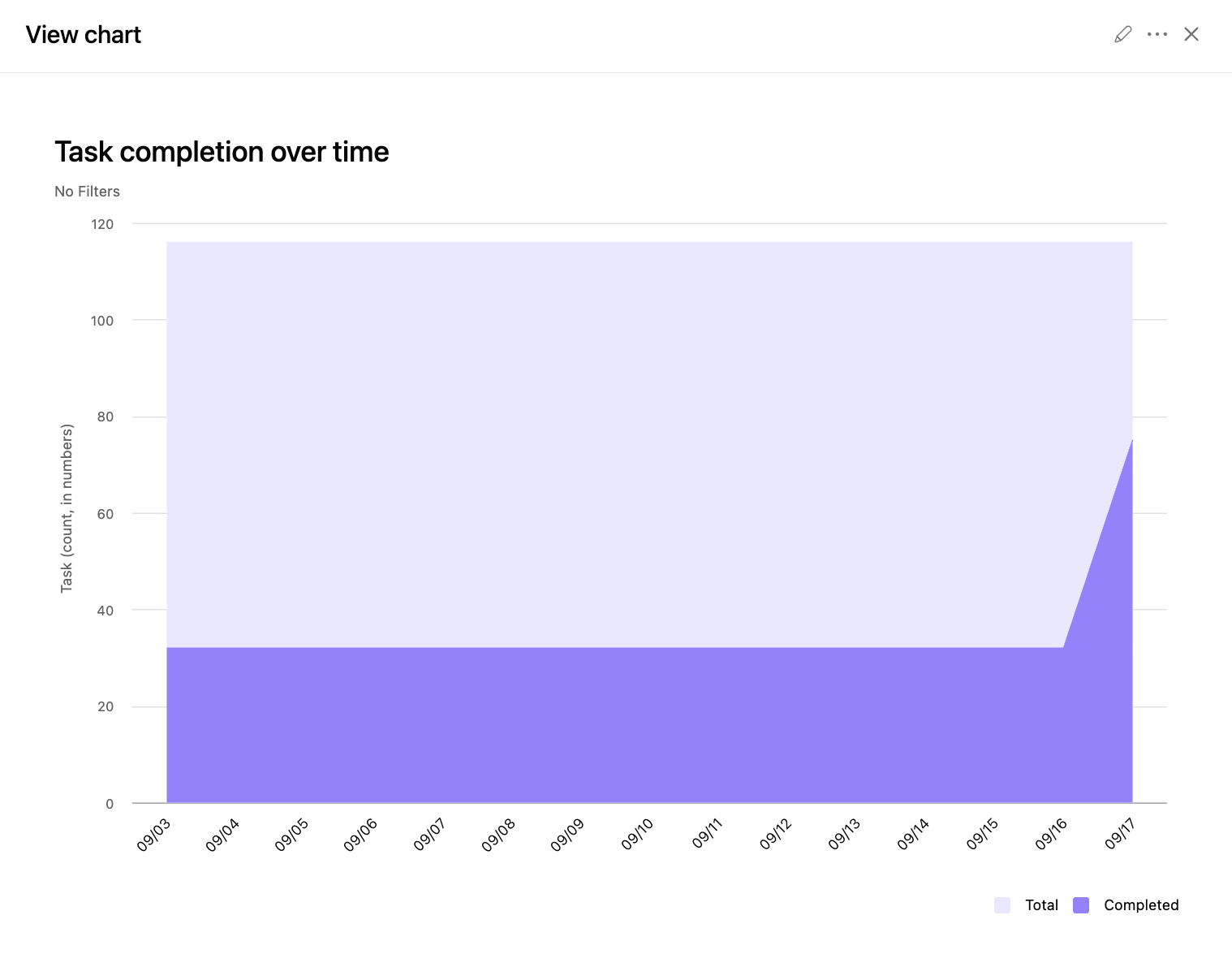
Needs: realistic due dates.
4. Task distribution across the team
Level: project dashboard for one team, portfolio dashboard to see across several
Answers: who is carrying too much.
Charts:
Bar of incomplete tasks by assignee
Stacked bar of incomplete tasks by assignee, grouped by priority
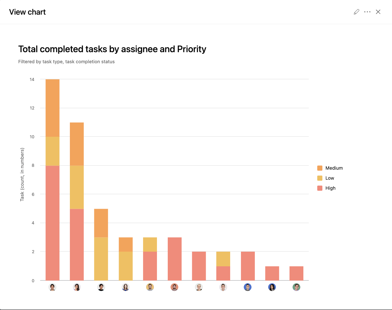
Needs: everything assigned. Unassigned work is invisible here, and you cannot chart it directly, so finding it means an advanced search rather than a widget.
Asana also has a dedicated Workload view that answers a related question with effort over time. This dashboard is the faster read, not the replacement.
5. Goals overview
Level: universal dashboard
Answers: are we on track against what we said we would do.
Goals reporting deserves more room than a paragraph here, so we wrote it up separately. See our guide to building a goals dashboard in Asana.
6. What is stuck
Level: portfolio dashboard
Answers: what has stalled, who is sitting on it, and which projects it is spread across.
Charts:
Number chart for incomplete tasks where Blocked is set to yes
Bar of blocked tasks by assignee
Bar of blocked tasks by project
Needs: a Blocked field that people set, and more importantly clear when the block lifts. A dashboard full of stale flags is worse than no dashboard.
One thing to be clear about. This runs on a custom field, not on Asana's dependencies. The native blocked by and blocking relationships are not available to charts, so if you want to report on what is stuck, someone has to mark it.
7. Request intake
Level: project dashboard on the intake project
Answers: how much is coming in, from where, and how fast we clear it.
Charts:
Line of tasks by creation date, optionally filtered by the last ninety days
Bar of requests by requesting team, filtered to creation date in the last ninety days
Number chart for requests still in the triage stage
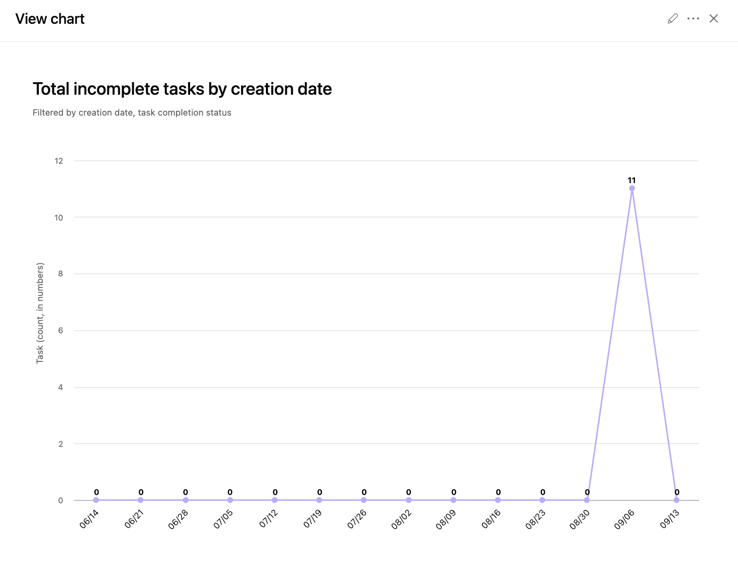
Needs: requests arriving through a form, so the fields are populated the same way every time.
8. How long work sits at each stage
Level: project or portfolio dashboard
Answers: where work slows down, and by how much.
Asana tracks how long a task spends in a section, and how long it holds each value of a custom field. Either one can be charted as a sum or an average. That is how "approvals feel slow" turns into "approvals average six days and everything else averages one."
Which chart you build depends on how your stages are set up.
If your stages are sections:
Bar of average time in section, grouped by section
If your stages are a dropdown field, such as Status or Stage:
Bar of average time in field value, grouped by that field
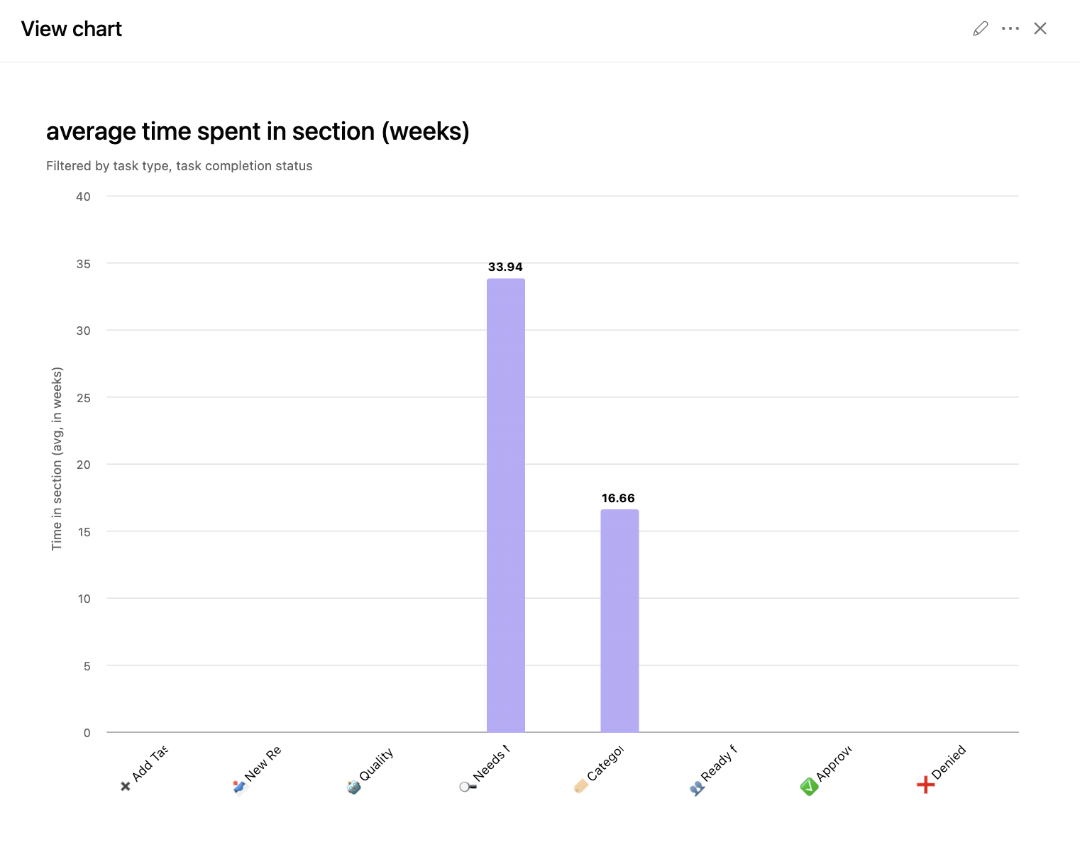
Needs: stages that work actually moves through, one at a time. Sections used to group work by client or by owner will give you nothing useful here.
Filter: completed tasks, with a completion date range. Without it you are averaging finished work together with things still sitting in the stage, and the number drifts every day.
One caveat worth knowing. Work that skips a stage never registers any time in it, so a stage most people bypass will look fast rather than unused.
9. Resource capacity
Level: portfolio dashboard
Answers: can we take on the next thing.
Charts:
Bar of estimated effort by assignee, filtered to incomplete and due in the next month
Bar of projects by team, filtered to active projects
Needs: an effort or estimate field, filled in at least roughly. Consistency matters more than precision.
Capacity planning is its own feature in Asana and answers this more thoroughly. This is the version you can build today with fields you already have.
10. Where the hours actually go
Level: portfolio dashboard, or a project dashboard for one piece of work
Answers: how much time work is really taking, and who is absorbing it.
Charts:
Grouped bar of estimated time and actual time by assignee, so the gap shows up in one chart
Bar of actual time by project
Number chart for total actual time, filtered to completion date this quarter
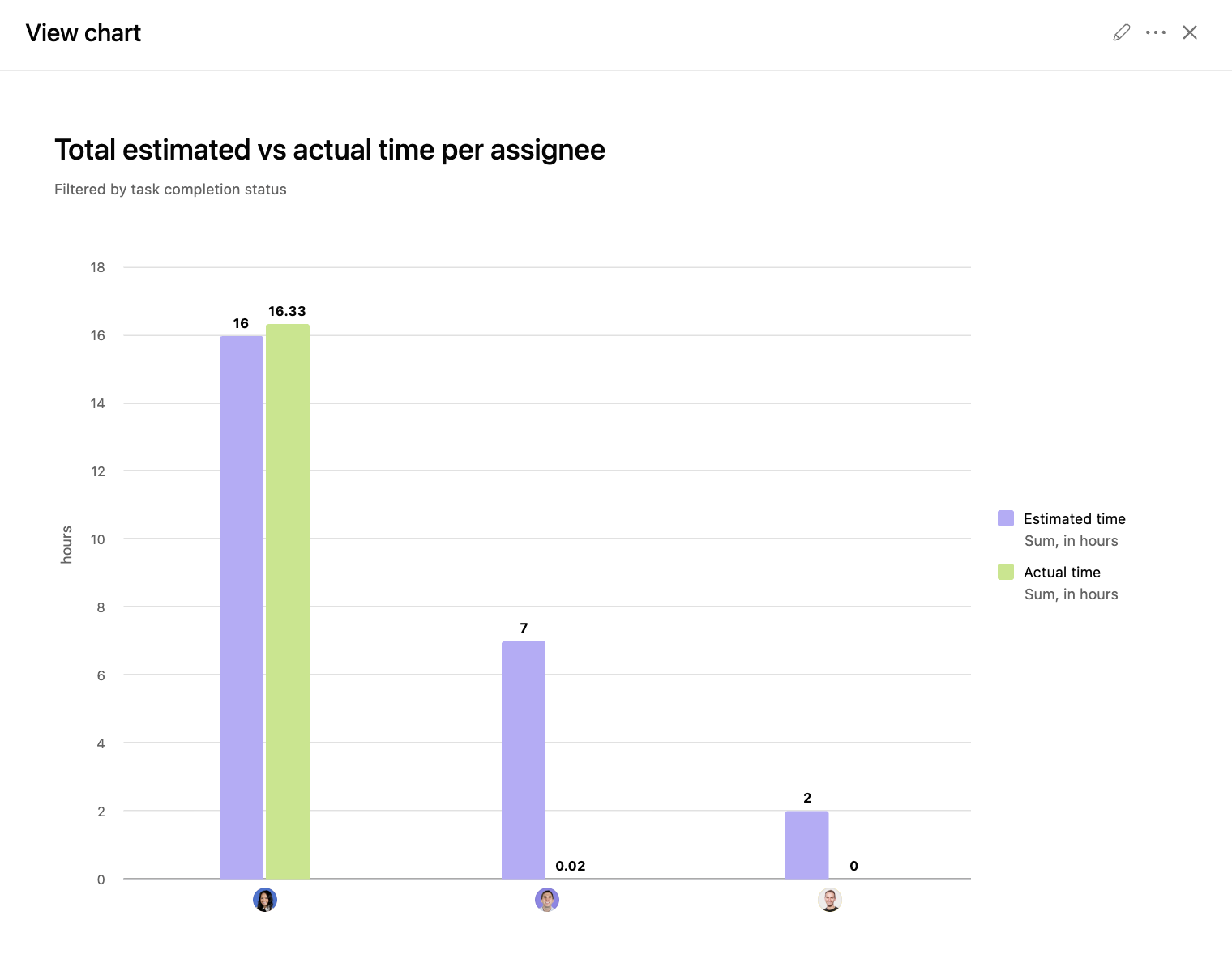
Needs: estimates set when work is scoped, and people logging actual time. No field discipline elsewhere will save this one if the hours never get entered.
What Asana dashboards cannot do
Every reporting tool has edges. Knowing Asana's saves you a week of trying to build something that was never going to work.
Counting how often something moved backwards. How many times a deliverable went back for revision is not something a chart can count. The activity history has it, the reporting layer does not.
Reporting on dependencies. You cannot build a chart that tells you how many blocked tasks there are in a project or a portfolio. The blocked by and blocking relationships are not available to the chart builder at all. If you want to see what is stuck, someone has to mark it with a custom field.
Sharing outside Asana. There is no public link. Anyone you want to show a dashboard to needs an Asana account and access to the underlying work, which rules out sending one to a client or a board member who is not in your instance.
Exporting the dashboard. You cannot export a dashboard as a whole. The option you have is saving each chart as a PNG, one at a time.
Reporting on what was never captured. If the field is empty, the chart is empty. This sounds obvious and it is still the single most common reason a dashboard disappoints.
What is not on this list, despite what you may have read elsewhere, is duration. Time in section and time in custom field are both chartable, as covered in example 8.
Sharing, permissions, and who sees what
A dashboard shows the viewer what they already have access to. It does not grant access, and it does not hide data from someone who has it.
So someone without access to a project will see gaps in a cross project chart rather than the full picture. If a stakeholder says your numbers look wrong, permissions are the first thing to check.
Who can change a dashboard works differently by level.
On a universal dashboard there are two roles. Viewers can look at it. The dashboard admin can change it, and there is only ever one admin per dashboard.
On project and portfolio dashboards it follows the permissions already on the project or portfolio. Anyone with edit access can add charts or change the ones that are there.
Getting data out: export Asana to CSV, Google Sheets, Power BI, and Tableau.
Sometimes the answer genuinely is not a chart in Asana, and that is fine.
CSV export is the quickest route for a one off analysis. Export, open in a spreadsheet, do the thing Asana will not do. If you are looking for an Excel export, this is it: Asana exports CSV, and Excel opens it directly, so there is no separate Excel option to hunt for.
Google Sheets works well for recurring reporting that needs calculations Asana cannot perform, or for combining Asana data with something else. The sheet stays connected and refreshes on a schedule rather than instantly, so it is not a live view. Fine for a weekly report, not for something someone is watching during a meeting.
Power BI and Tableau are the right call when Asana data needs to sit alongside finance or CRM data in a single view, or when someone needs historical trending that goes further back than your comfort with Asana's own charts.
The API is for when reporting needs to be automated into something else entirely.
A reasonable rule: if you are exporting the same data every week and doing the same manipulation to it, that is a sign either the field structure needs work or the reporting belongs outside Asana permanently. Doing it by hand every Monday is the worst of both.
Custom fields are the foundation everything else stands on
Many of the charts in this guide depend on a custom field, and this is where most reporting projects quietly fail.
Not because the fields do not exist. Because there are nine versions of them.
Three projects have a Priority field, each created separately, each with slightly different options. A chart across all three shows three sets of values that should be one. The dashboard is not wrong. The field architecture is.
The fix is a field library: a shared set of fields defined once at the organization level and added to projects from there, rather than recreated each time. It is unglamorous work and it is the difference between reporting that scales and reporting that only works inside one project.
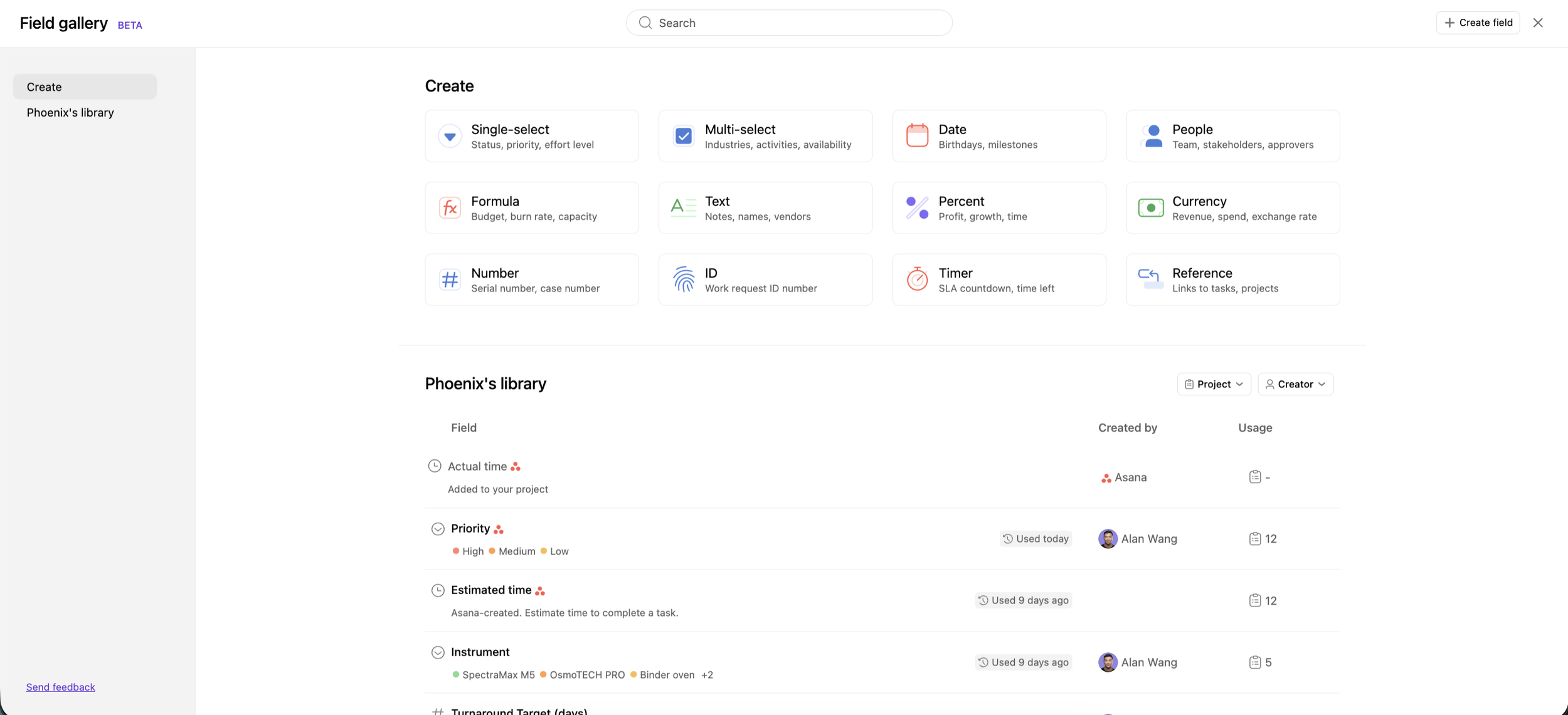
Two habits that keep it healthy. Decide who is allowed to create global fields, and keep that list short. And before anyone creates a field, have them check whether one already exists that would do the job. Most duplicates start with someone not finding the field they needed and building their own.
A good baseline is what makes a good dashboard. If you would rather have help setting that foundation up properly before you start building charts on top of it, that is what our workflow optimization package is for.
Where to start
Two questions before you build anything.
What do people keep asking you? That question is your first dashboard.
Who is going to look at it? That decides the level. A team lead can open a project dashboard. An executive will not go hunting for one.
Then look back at the ten examples above, find the one closest to your question, and build the charts. Start with one. Add the next once the first is being opened.
When the numbers come back, check they make sense. If they do not, the problem is usually the data rather than the chart. Fields half filled in, work sitting outside the projects it belongs to, tasks nobody ever assigned. Worth auditing before you build anything else on top of it.
If you would rather talk it through with someone, get in touch. We can work out what reporting you actually need, whether your setup is ready for it or the workflows and systems need work first, and where we could help with any of it.
In short
Asana's reporting is better than its reputation, and most of the limits people run into are field problems wearing a reporting costume. Pick the right level for your question, get your custom fields consistent, and start with one chart that someone is waiting for.
If you want the next one of these in your inbox, our newsletter goes out weekly.

Frequently asked questions
Is there an Asana dashboard template?
Partly. Universal reporting offers chart templates you can start from, but there is no way to save a custom chart as a reusable template. For projects there is a workaround: build the dashboard in a live project, then convert that project to a template. Asana saves the dashboard with it, so new projects from that template arrive with the same charts. You cannot build the dashboard from inside the template editor.
Do subtasks show in Asana reporting?
Yes, but not by default. When a chart reports on tasks there is a Subtasks filter, and switching it on gives you two choices: include subtasks alongside tasks, or show only subtasks.
Which Asana plan includes dashboards?
Project dashboards are available from Starter. Portfolio dashboards and universal reporting require Advanced or above. If you are rebuilding the same chart across several projects on Starter, that is the practical trigger to look at Advanced.
Can you export an Asana dashboard?
Not as a whole. You can save each chart individually as a PNG, one at a time, and there is no public link that would let someone outside Asana open the dashboard itself. If what you need is the data rather than the picture, export to CSV or connect Asana to Google Sheets, Power BI, or Tableau.
Are Asana dashboards real time?
Charts pull current data when you load them rather than streaming continuously, so what you see reflects the state of the work when the page loaded. Refresh before a meeting rather than relying on a tab you opened an hour ago.